Wednesday, 31 August 2011

PHOTOGRAPHY

my idea was created from what i imagined when i hear the song, nude, by radiohead.... i feel that there is a sexual connotation, whether its a boy or a girl... initially i felt as though a male was being seduced by a female, with her sensual dance moves, as she knows she is beautiful and powerful. he is either upset by her and her power over his sexual mind, and the way her body can take over his mind. i wanted to show this by using a beautiful girl, with alluring eyes, and her part- ner is pondering whether he is besotted with her, or it is the power she has over his mind, sexually. quite a sad thought, and a sad scene, as she knows how he is easily seduced by her and her body...

“You paint yourself white And fill up with noise But there'll be something missing”

another idea or emotion i got from listening to the lyrics of this song.. was the idea that a couple can feel so strongly for one another, for so long, believing that nothing could stop this feeling and power they feel. and when its over, you look back and it seems so incredible that its all over, and you now feel so alone. how did things go so wrong? because at the time, together you were both so sexual and powerful, and probably naive.

“Now that you've found it, it's gone Now that you feel it, you don't You've gone off the rails”
LIGHTING


FILM


SHOOT 1:


SHOOT 2:


FINAL IMAGE


Ready Steady

Design an easy-to-open tablet container for arthritis sufferers...


I decided to make a large round container that does not need opening, but rather twisted to make an opening...   

The name is Ready Steady... it is for people who need a pain free, boosted day... to be Ready for the day, and to remain Steady or stable....


Final 3D images for tablet container


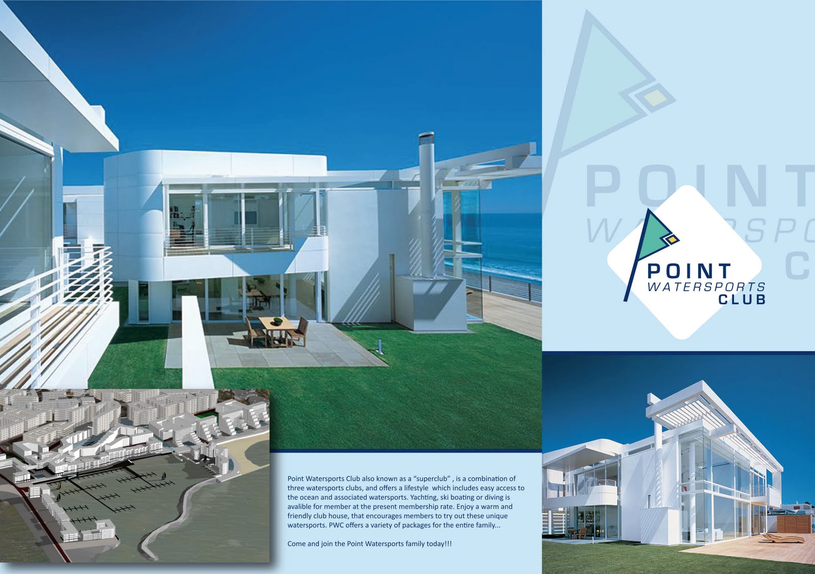
Point Watersports Club

Brand a watersports club using the current sub clubs, Point Undersea Club, Point Yacht Club and Durban Ski Boat Club.... 


THE WEBSITE


CORPORATE IDENTITY

BROCHURE OUTER

BROCHURE INNER

BRANDED ITEMS

BRANDED CAR

BRANDED TEES

Typography

Design a South African influenced Type...
I came up with some words that reminded me of the rural parts of our country... Kwashiokhor  (a disease caused from malnutrition, swollen tummies), Dakiwe (means "drunk" in Zulu), Mafuta sfebe ( is a Fat Bitch in Zulu Slang).... as well as my nickname... 2 Slice... (Zulu slang for a person who is thin, who resemble two slices of bread)...

Doodles to experiment with type


Working with 2 Slice....


Using photography... i wanted to find some super thin legs, bandy and stick like... very basic photo, quite harsh and un photoshop-finished...


i wanted this image to be the entire double page spread... with the font on top... 


the final


1 Minute Movie

As a group, we had put together a one minute movie... Slip ups can be Step ups... the basic plot is... a girl gets ready for her days work, and nothing goes well, there are numerous slip ups during her morning process of getting ready... her make up runs, her stocking rips, her hair gets messy, etc... and in the end, a guy rides past and winks at her, approving her accidental new 'grunge' style... therefore all her morning slip ups became a fashion step up....


We had to design a dvd cover, a dvd case, and a viral campaign, which will promote our 1min movie. I took the anti design route, and didnt want to make it an obvious design, instead, i wanted to take random images that were in the movie and base the design on those, so the viewer would be curious as to what the movie is really about... i used the knife and the grape fruit which feature in the movie, and with that and the title "slip ups can be step ups", there is not obvious relevance, making the audience curious, thus want to watch the movie....


DVD COVER FRONT


DVD COVER INSIDE (Grapefruit is the DVD)


Viral Campaign

POSTCARDS


Posters


Posters on street poles


Friday, 1 April 2011

The Traveling Hoodie

Charne and i wanted to go on a small road trip, down the south coast, passing Umzumbe and other small towns, taking photos and gathering items to help us with our travelling hoodie project. We planned to stay a night at Bazley caravan park, and try out some surfing the next day... 
we had high hopes and before we knew it, the hoodie was due....


So our next idea was to take things that reminded us of Durban city, and the things we saw on our way to tech (through Warwick Junction). We found many interesting things.... the food, the fabrics, there graphic design, the taxis, the pigeons... 


We decided we were going to create a hoodie that depicted these things that make us think of Durban, but put it on the hoodie in a way that is not obvious, but it looks like a pattern/design, rather then a jacket with realistic objects placed on....


We decided use the zip as our main vertical line, and place a cropped image onto this 'line' and reflect this image along the line... from a short distance, the hoodie looks like it has a bright pattern design, like focal point. The pockets have the same reflective idea, but it is a road and a railway line, from a distance, they look like a lined pattern, reflected along the vertical zip.


On the arms, we wanted one with henna designs, and the other with a shweshwe inspired design. On the back, we decided to keep it plain, as we felt the hoodie did not need to be entirely covered. So we kept it very simple and placed a spear on the bottom of the hoodie


Charne and i wanted to either screen print, or embroid the design on the jacket, but the quotes were both R500 plus... We knew we wanted a brightly coloured hoodie (as Durban is full of colour), so we decided to use fabric paint. It was fairly easy using the paint. We painted in an unrealistic style, inspired by the street salon images. We wanted the images painted, then outlined, as they are on these street salon portraits.


We had a good time painting the images onto the hoodie, as we each had a side, and because it was reflected, there was equal amounts of work being done by Charne and i. It is also interesting that we have two different styles of painting, but only if you look closely at the two jacket panels, would one be able to see that. It adds a personal touch, and we were not phased that the reflections were not exact. Infact we are very pleased.


Thursday, 10 March 2011

first time on the blog dogg

trying out this new thing that everyone has... including me now.... hmmm. its fantastic