Tuesday, 20 September 2011

Cookbook

Design a cookbook with a South African influence... must contain cover, introduction, contents and two recipes...


Once upon a time, in Southern Africa, there lived 2 sisters... Lauren and Dayle... both very different people... Dayle the rebel, and Lauren the prissy... Dayle being the younger of the two, was married, had two girls, and divorced by the age of 23, and Lauren, married still with two girls... 

Dayle and Lauren have always had an interest in tasty food, and their reason being... their mother could never cook nice food... it was always so bland and tasteless. Dayle is addicted to butter (won’t touch marg), and Lauren uses about 3 tablespoons of garlic per dish... The reason for their addictions, is again... because they were deprived of flavour in their childhood meals...

Dayle is my mother, and she can whip up a superb dish, as she had to experiment a lot with eggs in my childhood, as a result of poverty. 
She can make an egg dish seem eggless (my sister and I don’t eat egg to eagerly nowadays)... Lauren is my aunty... who can make anything 
really... her mains will contain garlic... and her puddings probably contain alcohol... (I once braved her tiramisu... and it was like throwing back a Stroh rum shooter per teaspoon).

These two vastly different humans decided to take the next step in cooking... Lauren has a small, self catering business which she manages and runs alone, cooking from her home kitchen...

My mother, Dayle, decided... she is entrepreneur of the year, and took a leap... She opened a large catering/food functions/cooking classes/oven-hob hiring/chef school in July 2011... called Fatcow Catering and Training school. The venue is enormous and can school 32 students, teaching them all there is to know about culinary arts and food 
education, practical and theory. She runs her school with executive chef Warwick Thomas, and has been firing it up in their 16-stove kitchen.

So here goes the cookbook of the year... Fatcow catering vs. my aunty Laurens catering. This book will give you a recipe from each of the sisters and its up to you to test them out, starting with their best South African inspired dish...


cover

contents


introduction

recipe 1

recipe 2

Thursday, 1 September 2011

Drawing magazine spread

Using drawing and photography, create a 3 page magazine spread, using the article provided, complete it with relevant imagery...

Doodles:


photography and drawing combined

final spread:


doughnuts packaging

design a package to fit 5 standard size ring doughnuts... must appeal to the 5 senses...


i decided to choose woolworths because of the crisp, clean packaging. I used the pastel colours and the flat imagery of the doughnuts.


Wednesday, 31 August 2011

PHOTOGRAPHY

my idea was created from what i imagined when i hear the song, nude, by radiohead.... i feel that there is a sexual connotation, whether its a boy or a girl... initially i felt as though a male was being seduced by a female, with her sensual dance moves, as she knows she is beautiful and powerful. he is either upset by her and her power over his sexual mind, and the way her body can take over his mind. i wanted to show this by using a beautiful girl, with alluring eyes, and her part- ner is pondering whether he is besotted with her, or it is the power she has over his mind, sexually. quite a sad thought, and a sad scene, as she knows how he is easily seduced by her and her body...

“You paint yourself white And fill up with noise But there'll be something missing”

another idea or emotion i got from listening to the lyrics of this song.. was the idea that a couple can feel so strongly for one another, for so long, believing that nothing could stop this feeling and power they feel. and when its over, you look back and it seems so incredible that its all over, and you now feel so alone. how did things go so wrong? because at the time, together you were both so sexual and powerful, and probably naive.

“Now that you've found it, it's gone Now that you feel it, you don't You've gone off the rails”
LIGHTING


FILM


SHOOT 1:


SHOOT 2:


FINAL IMAGE


Ready Steady

Design an easy-to-open tablet container for arthritis sufferers...


I decided to make a large round container that does not need opening, but rather twisted to make an opening...   

The name is Ready Steady... it is for people who need a pain free, boosted day... to be Ready for the day, and to remain Steady or stable....


Final 3D images for tablet container


Point Watersports Club

Brand a watersports club using the current sub clubs, Point Undersea Club, Point Yacht Club and Durban Ski Boat Club.... 


THE WEBSITE


CORPORATE IDENTITY

BROCHURE OUTER

BROCHURE INNER

BRANDED ITEMS

BRANDED CAR

BRANDED TEES

Typography

Design a South African influenced Type...
I came up with some words that reminded me of the rural parts of our country... Kwashiokhor  (a disease caused from malnutrition, swollen tummies), Dakiwe (means "drunk" in Zulu), Mafuta sfebe ( is a Fat Bitch in Zulu Slang).... as well as my nickname... 2 Slice... (Zulu slang for a person who is thin, who resemble two slices of bread)...

Doodles to experiment with type


Working with 2 Slice....


Using photography... i wanted to find some super thin legs, bandy and stick like... very basic photo, quite harsh and un photoshop-finished...


i wanted this image to be the entire double page spread... with the font on top... 


the final


1 Minute Movie

As a group, we had put together a one minute movie... Slip ups can be Step ups... the basic plot is... a girl gets ready for her days work, and nothing goes well, there are numerous slip ups during her morning process of getting ready... her make up runs, her stocking rips, her hair gets messy, etc... and in the end, a guy rides past and winks at her, approving her accidental new 'grunge' style... therefore all her morning slip ups became a fashion step up....


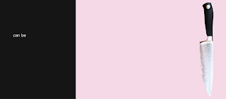
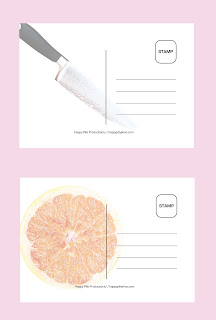
We had to design a dvd cover, a dvd case, and a viral campaign, which will promote our 1min movie. I took the anti design route, and didnt want to make it an obvious design, instead, i wanted to take random images that were in the movie and base the design on those, so the viewer would be curious as to what the movie is really about... i used the knife and the grape fruit which feature in the movie, and with that and the title "slip ups can be step ups", there is not obvious relevance, making the audience curious, thus want to watch the movie....


DVD COVER FRONT


DVD COVER INSIDE (Grapefruit is the DVD)


Viral Campaign

POSTCARDS


Posters


Posters on street poles